Drop off insights, Improved 'next' experience & Hide bad matches
Improved 'next' navigation
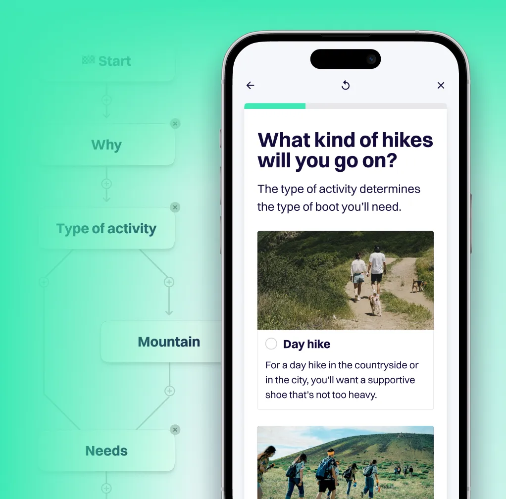
For single-choice questions, users can now simply click on an answer to navigate to the next question. For multiple-choice and numerical questions, the next button now draws more attention — and it's sticky, so no more scrolling on mobile!
Check out the video to see the new next navigation in action:
<<<filmpje>>>
Analyze improvements
We've split our insights widgets across two tabs: Analyze usage (for general usage insights) and Analyze questions (for insights related to the question and answer content).

We've also added a new key metric on the Analyze usage tab. You can now see how many views there were on the advice page of your app in any given time period.
The new progression from Sessions to Advice views to Click-through is much easier to understand and shows you exactly how users funnel through your app:

As you can see, we've also added tooltips to each metric in Analyze usage, to help you understand what each one represents.
Pop-up modal improvements
In addition to the new in-page integration, you can of course still use the regular 'start button' with pop-up modal as your preferred embed option. We've made some improvements here, too, which means less scrolling in the pop-up on questions with lots of answers.
We've fixed a bug that kept applications from being removed completely, due to a lagging analytics event.
Drop-off insights
To help you optimize your Q&A flow, you can now see how your questions perform in terms of drop-off:

Head to our new Analyze questions tab to discover these new insights: you'll see exactly which questions have a high (or low) drop-off!
To find out more about this much-requested feature, check out this blog post.
In-page integration (experimental)
You can now integrate your application directly on any page of your website. Rather than clicking the usual 'start button' and opening a modal, your users can now access the full application as part of the existing content of your webshop.
.png)
To find out more about this much-requested feature, check out this blog post.
To get started right away, check out this tutorial.
Hide bad matches from the recommendations a customer sees
You can now set a question as a hard requirement. Doing so ensures that products classified as a 'bad match' (X) will be excluded from the recommendations your customers see on the advice page. For example, perhaps you only want to recommend products that meet the size requirement a customer has specified. After all, other sizes would not be relevant for that particular customer.

You can find this new feature in 👉 Advice. Select a question, then activate the toggle beneath the question. Find out more on the uses (and risks!) of this feature in our tutorial: Treat a question as a filter.
Use bold, italics — as well as URLs!
You can now easily customize the format of supporting texts in your app. For example, use bold or italics to highlight certain words in info texts. Or add a link to a blog post with background info.
Another great use of this feature is to link to a related app from the advice page, as shown in this example:


Stop losing customers to choice paralysis
Provide the right advice - self-serve at scale to massively grow your conversion rates.

